A marketing funnel becomes easier to understand when you follow a real buyer’s path from an advertisement to the page behind it. What question does the ad raise? Does the landing page answer it? What is the buyer asked to do next?
In the accompanying video, Orrett Davis examines public examples from Butterfly Network’s website and advertising. This is an analysis of the examples shown in the recording, not a current company revenue assessment or a Mighty Orbit client result.
The useful takeaway is the structure: different messages lead to different pages, with proof and calls to action matched to the audience’s stage of awareness. This article focuses on that structure rather than treating the recorded campaigns as a live account audit.
Start with the buyer’s level of awareness
Someone encountering a device for the first time has different questions from someone comparing it with an existing solution.
The video uses awareness, consideration, and conversion to organize the funnel. Early content introduces the problem and makes an alternative understandable. Later content explains the differences, supplies evidence, and makes the next commercial action clear.
That distinction should affect both advertising and landing pages. A cold audience may need a demonstration of the product in use. A returning visitor may need implementation information, a comparison, or a direct route to a conversation.
The B2B marketing funnel guide develops this idea further: campaigns need to serve buyers who are ready now and people who are still learning.
Give the main pages different jobs
The recorded teardown identifies several page types that work together. Each has a purpose beyond simply collecting another form submission.
- Homepage: Introduces the company, product category, audiences, and reasons to investigate.
- Product page: Explains capabilities and benefits in more detail.
- Industry or audience page: Connects the product to a specific setting, such as medical education or a health system.
- Comparison page: Helps a buyer understand why they might choose this approach over an alternative.
- Demo page: Offers a way to see the product or speak with the team.
- Purchase page: Supports visitors ready to take a commercial step.
The lesson is not that every company needs the same number of pages. A focused product business may need fewer. The important question is whether each page answers a distinct buyer need and connects naturally to the next step.
Sending every advertisement to the homepage makes that harder. A specific message creates an expectation that a broad company overview may not satisfy.
Match proof to the audience
One of the stronger examples in the video is the use of audience-specific evidence. The education page includes examples relevant to educational institutions, rather than relying entirely on general company proof.
A health system evaluating a product may want different reassurance from an individual practice or training program. The page should reflect that difference in its examples, terminology, and explanation of the buying process.
This does not require inventing a new story for every audience. Start with the evidence available and identify where it is most relevant. A customer interview might supply an operational example for one page and a training example for another, provided the context remains accurate.
Use approved, supportable evidence. Logos can establish familiarity, but a relevant case study can explain how a customer evaluated and used the solution. Our case study collection shows how specific business situations can become useful proof.
Give buyers a way to learn before speaking to sales
The demo experience in the recording offers a choice between viewing a short product video and contacting the sales team.
That is an important design decision. Some visitors want a first look before deciding whether a conversation is worth their time. Others have already researched the product and want to discuss their situation.
A single mandatory sales step can create unnecessary friction for the first group. A page with no clear route to a conversation can frustrate the second.
A useful demo page therefore explains what a visitor can learn, offers the appropriate next step, and sets expectations for a meeting. The choice should fit the product and sales process rather than being added simply to create more buttons.
Use creative to show the product’s relevance
The video identifies several creative approaches in the recorded campaign set: product demonstrations, practitioner perspectives, short testimonials, audience-specific examples, and comparisons between an older process and a newer one.
These formats answer different questions. A demonstration shows what the product does. A customer perspective provides context for its use. A comparison helps a buyer understand a meaningful difference.
The transferable principle is visual clarity. A viewer should be able to understand the product’s role without decoding a dense feature list. For a medical product, that still requires accurate claims and appropriate permission for any customer or clinician material used.
Do not confuse variety with volume. Several creative concepts with distinct jobs can be more informative than many small variations of the same message.
Connect the advertisement to the right page
The final step is to map each message to a destination. An education-focused ad should lead to education-specific information. An ad emphasizing a product capability should lead to the explanation and evidence for that capability. A purchase-oriented message should make the buying action easy to find.
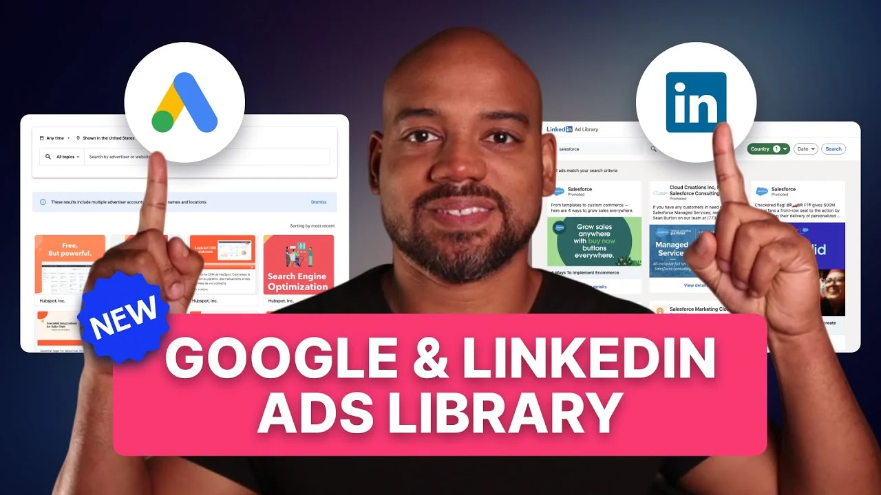
Public ad libraries help reveal those relationships, but they do not expose every campaign setting or result. The video’s interpretations of likely remarketing and targeting are hypotheses based on public material, not verified access to the account.
That same distinction matters in your own competitor research. Observe the creative and destination first. Then record the strategy you think they suggest as something to test, not a proven explanation of performance.
For a repeatable research worksheet, follow the LinkedIn and Google ad library research process.
Build your own message-to-page map
Choose one audience and list its main questions in order. Put an existing page or asset beside each question. Then connect the ads that introduce those questions to the most relevant destination.
Where a question has no answer, you have a content gap. Where an ad promises something its landing page does not address, you have a mismatch to fix before increasing spend.
Watch the original Butterfly Network marketing funnel breakdown on YouTube to see the recorded page and creative examples.
FAQ
Is this a current audit of Butterfly Network’s advertising?
No. It is an explanation of the public examples examined in the original video. Campaigns, website pages, product information, and company figures may have changed since the recording.
Do you need a separate landing page for every ad?
Not necessarily. Several ads can share a page when they address the same audience and question. Separate pages are useful when the buyer context or promised information materially differs.
Can an ad library prove that a campaign is profitable?
No. Public creative and landing pages reveal messaging and structure, but they do not establish spend, conversion quality, or profitability.
What should a smaller healthtech company apply first?
Start by matching one audience, one clear message, relevant proof, and an appropriate next step. Expand only when the relationship between those pieces is working.
Want to find the gaps between your ads and landing pages? GET MY FREE PIPELINE AUDIT.